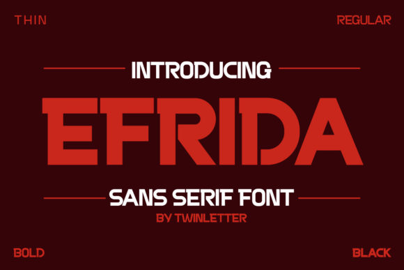
Quaxcite: A Bold, Confident Display Font
First Glance: Sharp, Slightly Edgy, Unmistakably Present
Opening Quaxcite for the first time, I didn’t see “just another display font.” I saw a typeface with attitude—tight letterforms, subtle geometric tension, and a quiet confidence in its proportions. It’s not loud for the sake of noise; it’s assertive because it needs to be. The uppercase feels architectural—clean joints, crisp terminals, a slight inward curve on diagonals that adds warmth without softening its stance. Lowercase is more restrained but never shy: x-height is generous, counters are open, and spacing breathes just enough to avoid crowding. Quaxcite doesn’t whisper—it leans in. It belongs in projects where clarity meets character: premium skincare branding, indie book covers, gallery posters, boutique packaging, or a founder’s keynote slide deck.
Where Quaxcite Earns Its Place in Real Work
In logo design, Quaxcite holds up remarkably well—even at small scales on favicons or app icons—because its core shapes are distinct and unambiguous. I’ve used it successfully as a primary mark for a ceramic studio and a wellness podcast, both times pairing it with a neutral sans serif (like Inter or Poppins) for body copy. It anchors the identity without overwhelming it.
For packaging design and product labels, Quaxcite shines on front-facing panels: name, flavor, collection line. Its weight distribution makes it legible under quick glances on shelves or in online thumbnails. I tested it on matte kraft paper and glossy white stock—both worked, though I recommend avoiding ultra-thin weights for physical print unless you’re using high-res offset.
In social media graphics and digital ads, Quaxcite cuts through visual noise. It performs especially well in Instagram carousels and Pinterest pins where bold hierarchy matters more than paragraph flow. On websites, it’s ideal for headers and hero text, but skip body copy—this is a display font, not a workhorse. Same goes for editorial design: use it for pull quotes, section dividers, or masthead treatments—not article text.
It’s also surprisingly versatile for printable design: wedding invitations, limited-run zines, craft fair banners, and even Cricut projects. The clean outlines render crisply on vinyl and paper cuts. For Canva templates, Quaxcite adds instant polish—especially when layered over muted photography or minimalist layouts.
Use With Intention—Not Everywhere
Quaxcite isn’t built for long reading. Don’t force it into paragraphs, captions, or dense UI elements. Its strength lies in brevity: short phrases, brand marks, decorative accents, and premium packaging where tone and memorability outweigh utility. It’s excellent for social posts with one-line hooks (“Bold choices start here.”), but avoid stacking multiple lines of Quaxcite in tight spaces—kerning adjustments are often needed manually.
I’ve seen it misused in email headers with tiny font sizes (under 24px), where its fine details vanish. And while it reads cleanly on screens at 36px+, don’t rely on it for accessibility-critical text—its contrast and letter distinction aren’t optimized for WCAG compliance in body contexts.
How It Shapes Perception
Used well, Quaxcite elevates brand consistency by giving visual weight to key messages without sacrificing sophistication. It signals intentionality—not trend-chasing. That builds audience trust, especially among discerning buyers who associate strong typography with quality craftsmanship.
Readability is situational: superb in headlines, limited in extended use. Hierarchy is intuitive—you instinctively know what’s primary and what supports it. Recognition grows quickly; after two or three touchpoints, people begin associating Quaxcite with your brand’s confident, grounded energy.
It subtly shifts visual mood—not playful, not austere, but quietly assured. That makes it effective for brands walking the line between modern and timeless, like sustainable fashion labels or artisanal food producers.
Designer Notes You’ll Actually Use
- Test it in black and white first. Quaxcite’s personality lives in its structure—not color. If it works flat, it’ll work anywhere.
- Check small-size readability. At 20px or below on screen, some weights lose definition—stick to Medium or Bold for digital display above 28px.
- Try it on real mockups. Not just PNGs—place it on a product shot, a fabric swatch, or a coffee cup render. See how it sits in context.
- Compare uppercase and lowercase side-by-side. Quaxcite’s caps have more presence, but its lowercase has surprising versatility in subheads or short tags.
- Review spacing carefully. Default tracking can feel tight in all-caps settings—add 20–40 units of letter-spacing for impact without strain.
- Pair it thoughtfully. Next to a warm serif font (like Lora or Playfair), Quaxcite adds modern contrast. Against a clean sans serif font (like Manrope or Montserrat), it creates rhythm and focus. Avoid pairing it with busy script font or decorative handwritten font—it competes, not complements. Try it beside another display font only if their personalities are clearly distinct (e.g., Quaxcite + a delicate inline sans).
- Confirm commercial licensing. As a premium font, Quaxcite requires proper licensing for client work, digital product resale (like Canva templates), or printable design sold on Etsy. Double-check usage rights before finalizing any brand identity system.
A Final Thought for Practitioners
Quaxcite won’t solve weak strategy—but in the hands of a thoughtful designer, it sharpens execution. It’s not flashy, not novelty-driven, and not trying to be everything. It’s a focused tool: precise, reliable, and quietly expressive. Whether you’re refining a modern typography system for a startup or designing a one-off merchandise drop, Quaxcite earns its place when you need clarity with character. Use it where attention matters—and let everything else recede.