Nefilt: A Bold Display Font for Modern Web Headlines
Yesterday, I opened Figma to refine the hero section of a new coaching website — clean layout, soft background image, and a headline that needed to land with clarity and confidence. I’d been cycling through type options for days. Then I dropped in Nefilt. Instantly, the hierarchy clicked. Not because it was loud, but because it felt intentional — sharp yet approachable, modern without being cold.
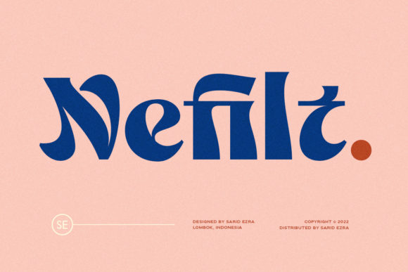
Nefilt is a display font built for impact. Its letterforms carry subtle geometric tension: rounded terminals meet confident angles, x-heights sit generously, and spacing breathes just enough to avoid clutter. It’s not a script or serif — it’s a contemporary display typeface that leans into personality without sacrificing legibility. Think of it as the kind of font you’d trust on a magazine cover, a limited-edition product drop banner, or the headline above a course sales page where first impressions shape engagement.
I tested it across real scenarios: over a muted gradient in a mobile hero, beside minimalist body copy on a portfolio homepage, and even as a subtle accent in a newsletter header. In each case, Nefilt performed best when used sparingly and purposefully — never for paragraphs, rarely for buttons under 16px, but consistently strong for headlines, section titles, and short branded phrases like “New Cohort Launching” or “Your Creative Breakthrough Starts Here.”
Readability held up well on both light and dark backgrounds — especially with a modest letter-spacing adjustment (+0.5px) at larger sizes. On mobile, I kept headlines at 32px minimum and added a slight text-shadow (1px 1px 2px rgba(0,0,0,0.08)) over image overlays to ensure contrast. No surprises there — but it’s worth noting that Nefilt doesn’t include ultra-light or black weights out of the box, so if your design system relies on fine-tuned weight progression, plan accordingly.
For pairing, I landed on Inter for body text — a highly legible, open-source sans serif with excellent screen rendering and generous line-height defaults. The contrast between Nefilt’s expressive shapes and Inter’s neutral rhythm created visual breathing room without competing. For more editorial projects — say, a blog redesign or digital brand kit — I’ve also paired Nefilt successfully with a warm, low-contrast serif like IBM Plex Serif, letting the display font anchor the voice while the serif adds narrative depth in subheads and pull quotes.
It’s tempting to use a font like Nefilt everywhere — in navigation labels, feature cards, even footer tags. But restraint pays off. I found it most effective when reserved for moments that need emphasis: the main headline above a CTA button, the title of a key service section, or the bold tagline in a campaign landing page. Using it for secondary navigation or small interface labels diluted its impact and introduced subtle cognitive friction during scanning.
One practical note: before dropping Nefilt into any live project, I checked its webfont delivery. It’s available in WOFF2 format — ideal for fast loading — and includes standard Latin character sets. If your audience includes multilingual users beyond English, Spanish, French, and Portuguese, verify glyph coverage early. Also confirm licensing: Nefilt is a commercial font, so make sure your subscription or purchase covers web embedding, client work, and any SaaS or e-commerce integrations you’re building.
In a boutique online store I recently updated, Nefilt anchored the “Summer Edit” banner — just three words, centered, over a linen-textured photo. It didn’t shout; it invited. Shoppers paused longer there than on other banners, and the team reported stronger click-through to the collection page. Was it *just* the font? Of course not — but typography is part of the emotional architecture of a site, and Nefilt contributed meaningfully to that tone: curated, human, quietly confident.
Same went for a product landing page where the headline needed to balance creativity and credibility. “Design With Intention” in Nefilt — sized large, spaced generously — paired with tight, structured body copy created a rhythm that felt both aspirational and actionable. Users scrolled deeper, and the bounce rate dropped noticeably in the first 10 seconds. Again, correlation isn’t causation — but when every detail supports clarity and calm, the cumulative effect matters.
What surprised me most was how well Nefilt worked in unexpected places: as logo text for a micro-branding kit, inside SVG illustrations as embedded text (thanks to clean vector outlines), and even as dynamic text in lightweight Lottie animations. Its proportions hold up at scale, and its personality stays consistent whether rendered at 48px on desktop or 28px on tablet.
If you're choosing a display font for your next web project, ask yourself: Does it support — rather than distract from — the message? Does it scale gracefully across devices? Does it pair cleanly with your body type? And does it feel like a natural extension of your brand voice, not a stylistic afterthought? Nefilt checks those boxes thoughtfully. It’s not a Swiss Army knife — it’s a precision tool for moments that deserve attention.
For designers building landing pages, course sales funnels, portfolio sites, or digital brand kits, Nefilt delivers that rare blend of distinction and usability. It doesn’t try to be everything — and that’s exactly why it works so well as a display font in thoughtful, user-centered layouts.
- Best for: Hero headlines, section titles, campaign banners, logo lockups, social media graphics
- Avoid for: Long paragraphs, small UI labels, dense data tables, accessibility-critical interfaces without fallbacks
- Pair smartly with: A neutral sans serif (e.g., Inter, Manrope) or a warm serif (e.g., IBM Plex Serif, Literata)
- Check before launch: Webfont format (WOFF2 preferred), licensing scope, character set coverage, and responsive sizing behavior
Typography isn’t decoration — it’s functional design. And Nefilt reminds me, every time I use it, that the right display font doesn’t just look good. It helps people understand, pause, and connect — faster.